BRANDING, ANIMATION, VISUAL IDENTITY
◷ 4 MIN READ
LAVA CIRCULAR
Interdisciplinary Cultural Circuit on the Island of El Hierro (Canary Islands). Active since 2017, it offers a journey to discover the territory by visiting its three municipalities (Valverde, El Pinar, and La Frontera) through evolving itineraries where the program unfolds; musical projects, workshop-talks, and artistic actions that revolve around the traditional and contemporary culture of the Canary archipelago, varying its main themes in each edition.
Various creatives present projects and initiatives that energize unique locations on the island itself. A close encounter and participatory event that generates exchanges of knowledge among participant-artists, attendees, and local residents.
PROJECT GOALS (I)
The Canary Islands have a rich history spanning thousands of years, with indigenous civilisations predating European arrival in the 15th century. While the territory and its people have evolved over time through cultural exchanges, the essence remains rooted in this mix. Despite limited evidence of this past in the modern era, preserving our heritage is crucial. Santana Santana, from Gran Canaria, approached me to explore our ancestral history, recognising the importance of understanding our roots for shaping the future.
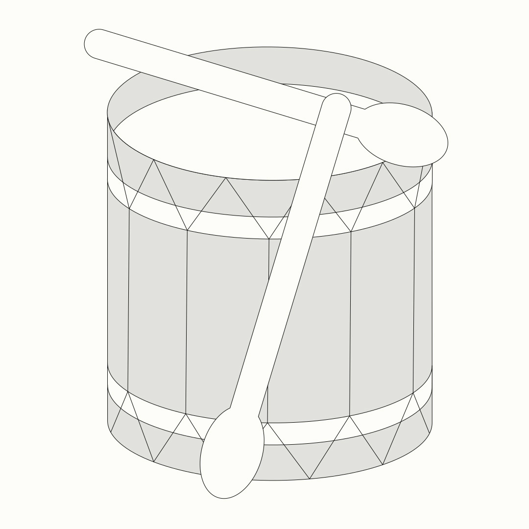
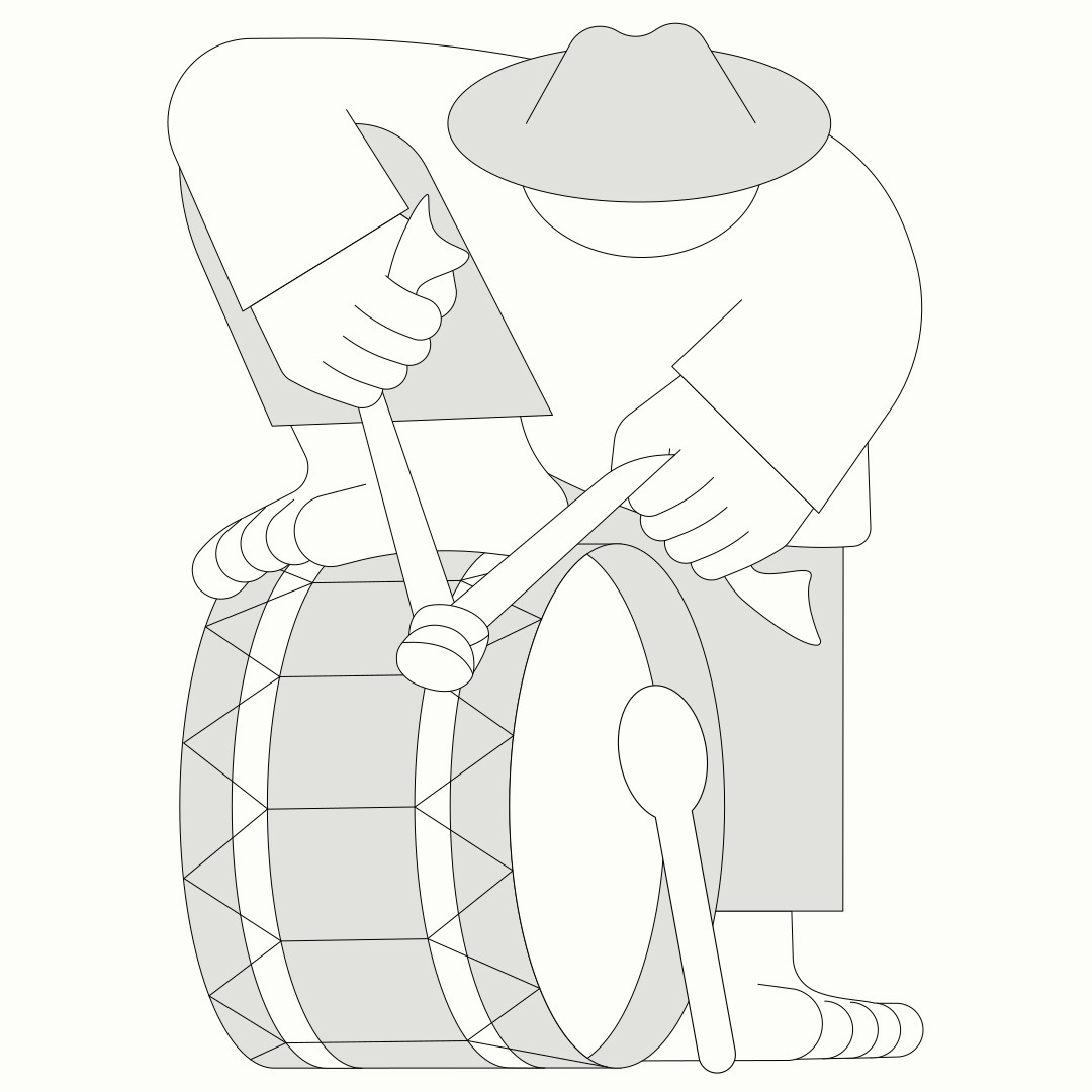
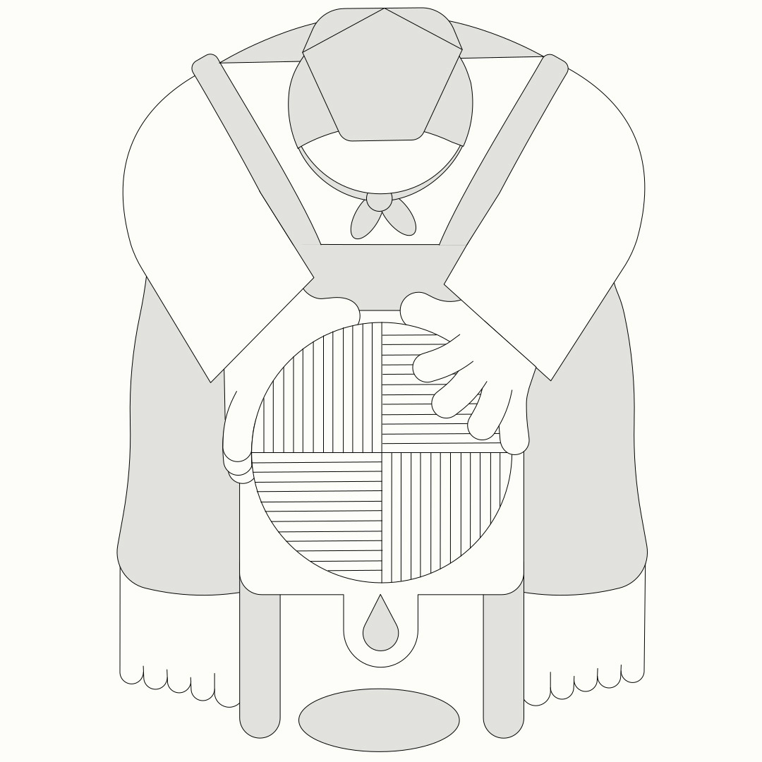
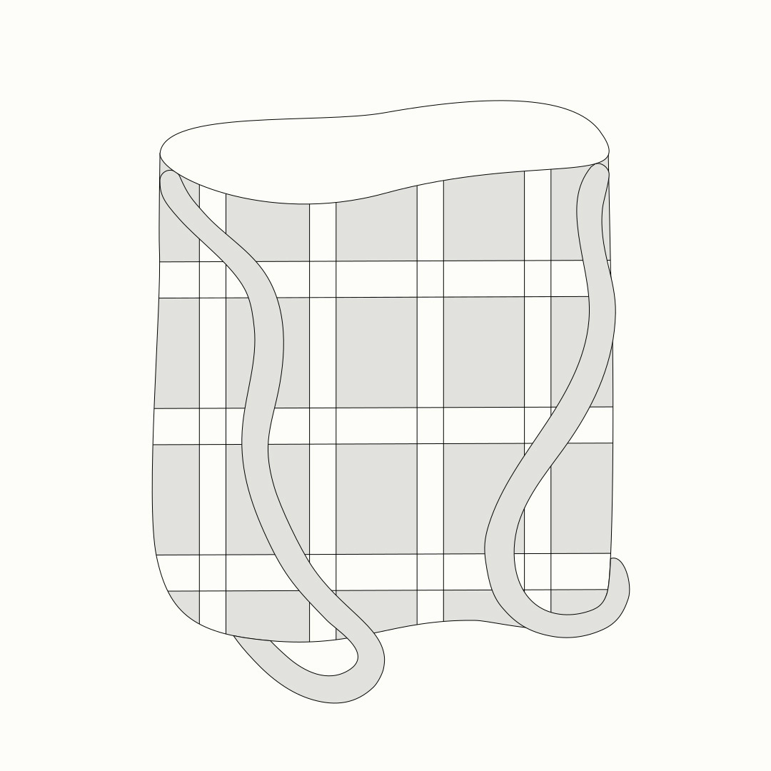
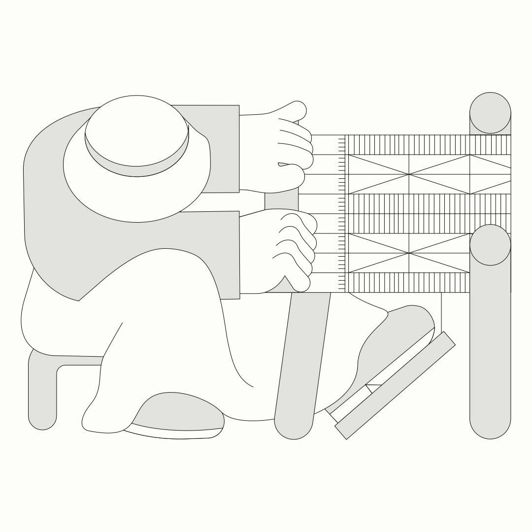
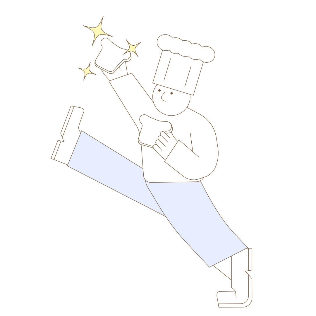
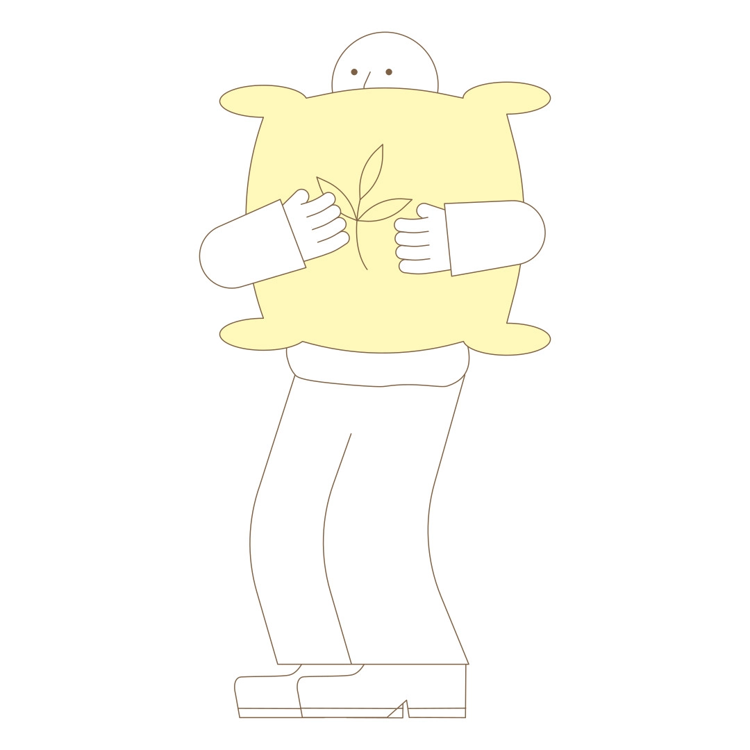
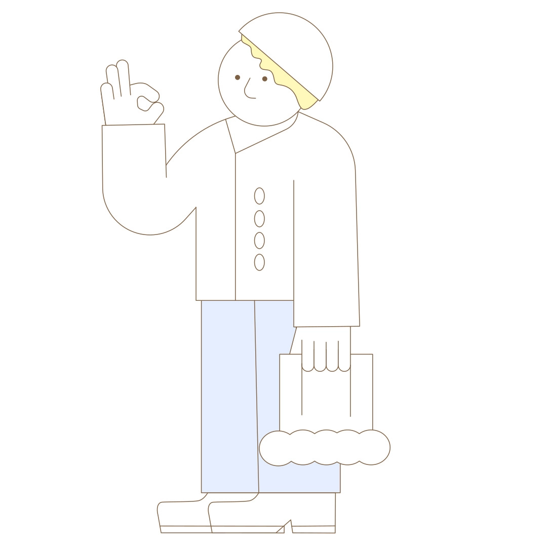
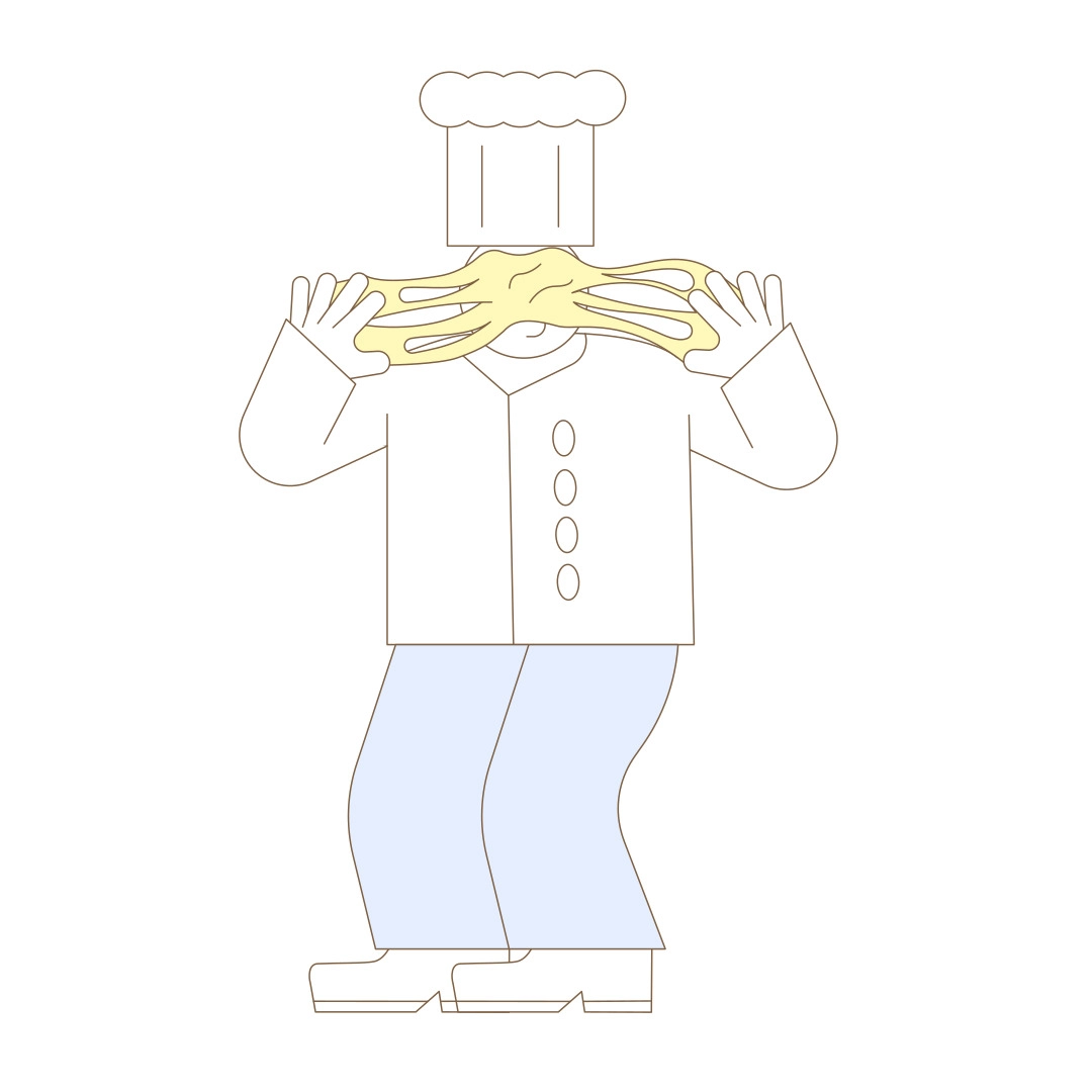
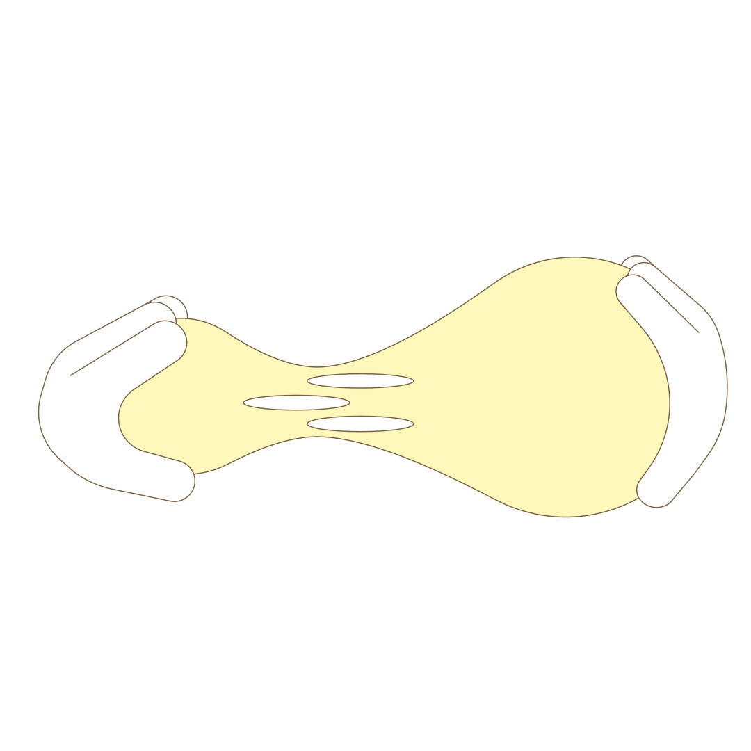
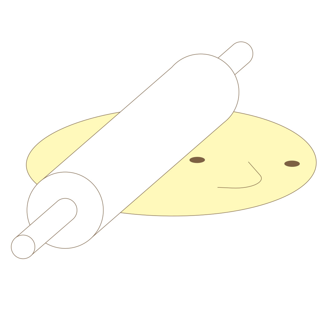
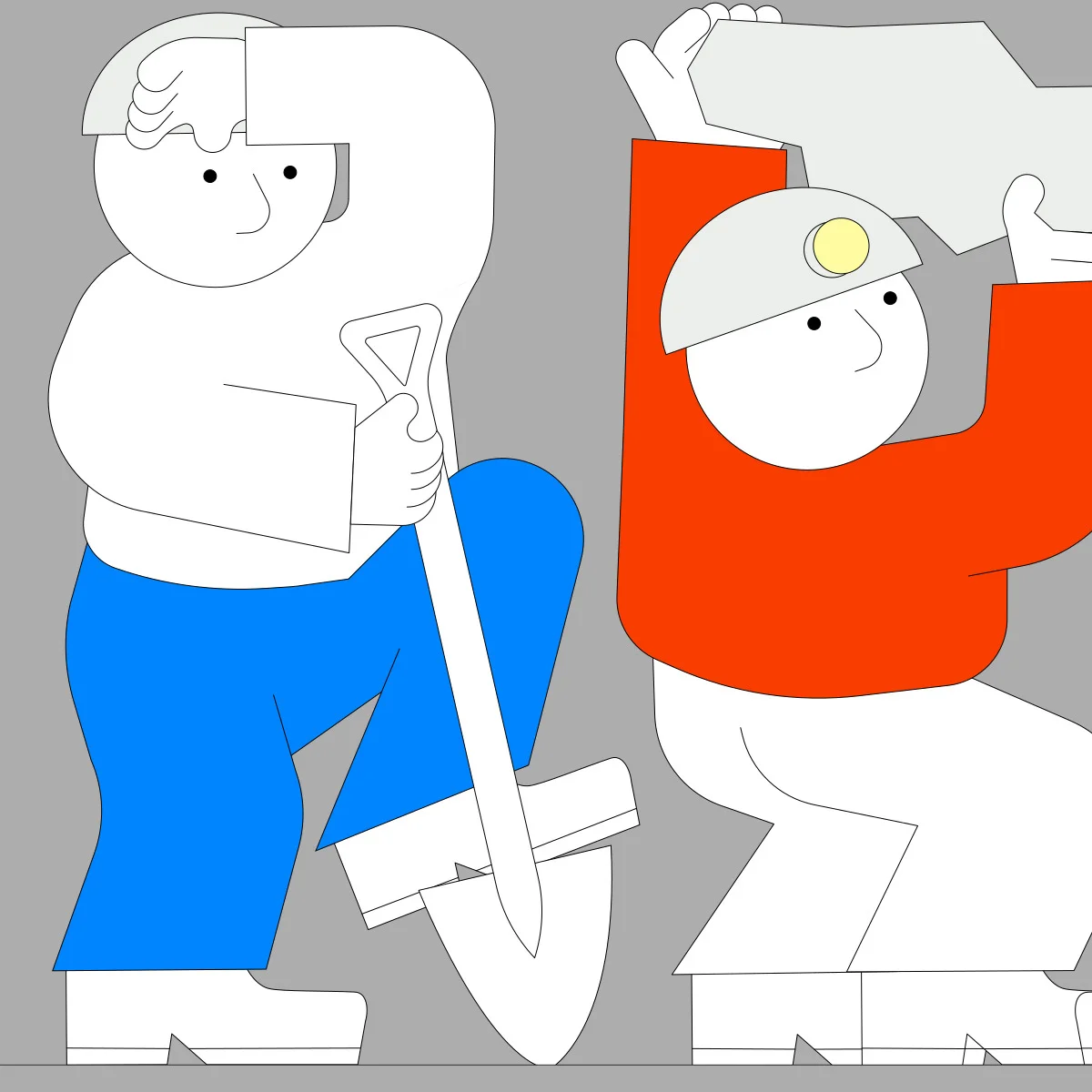
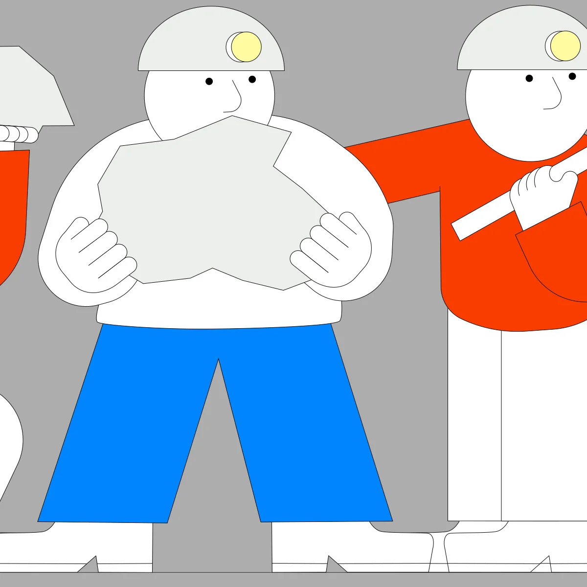
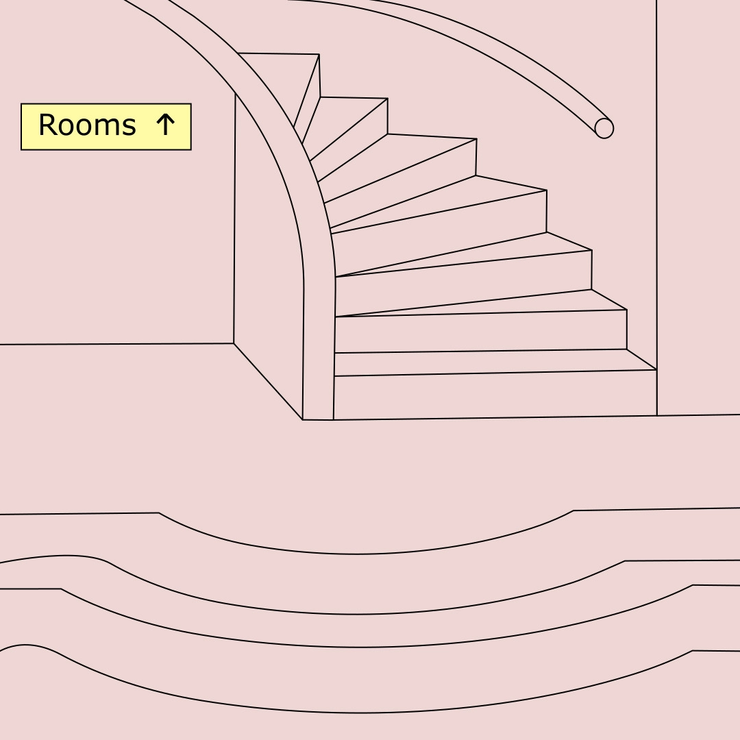
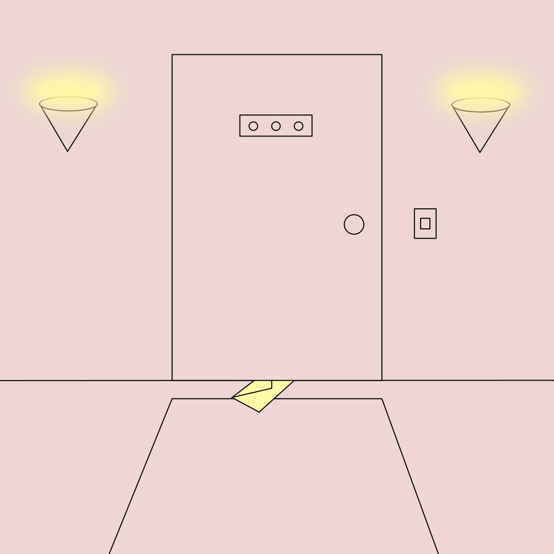
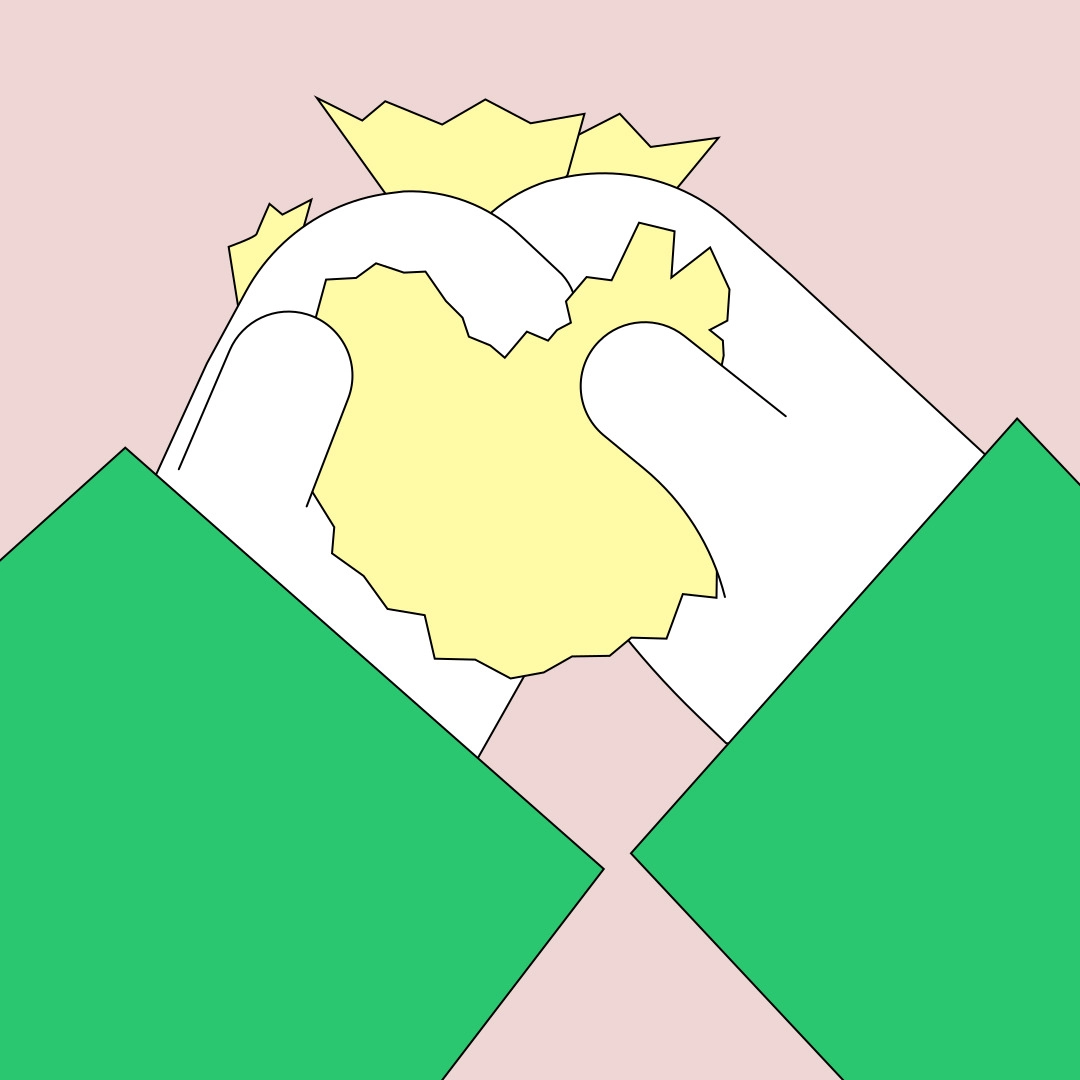
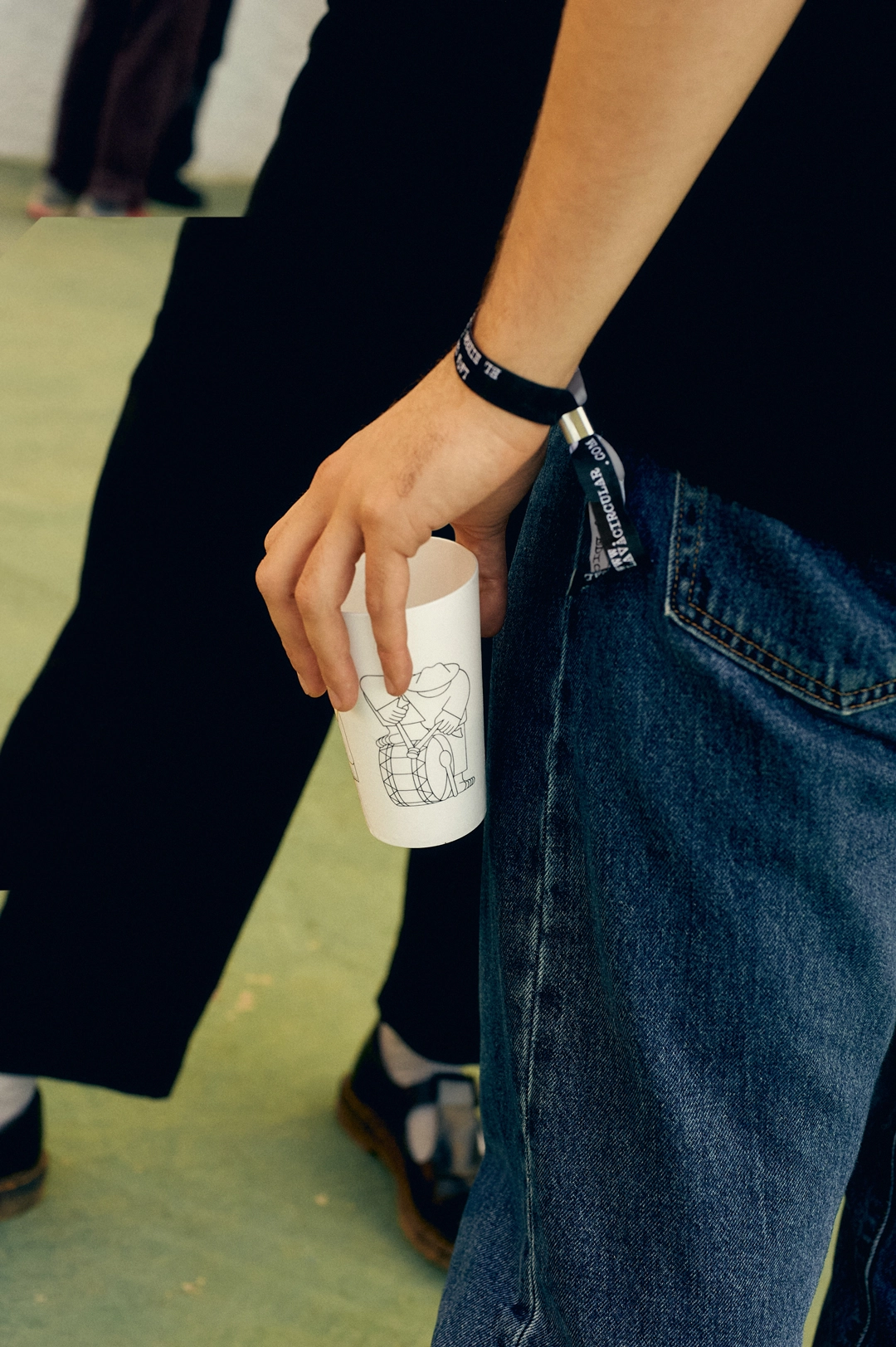
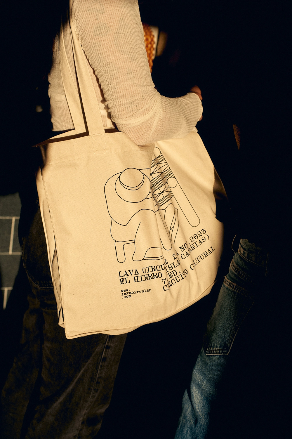
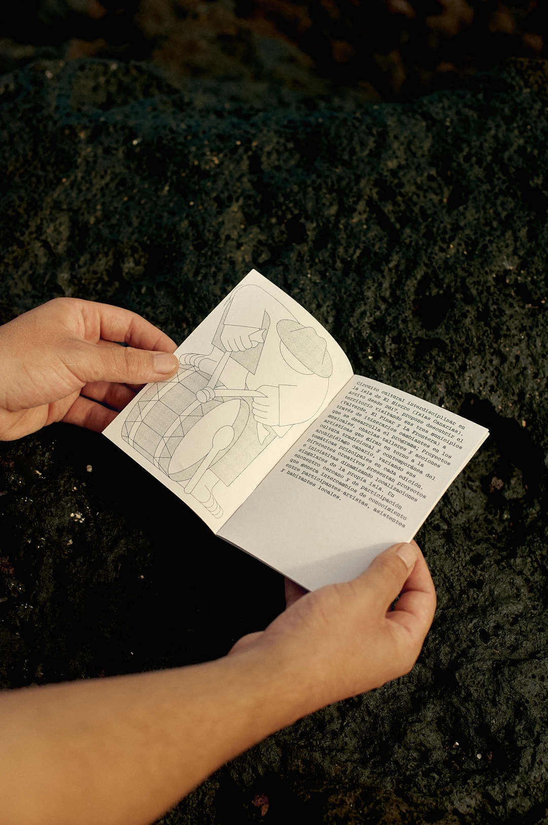
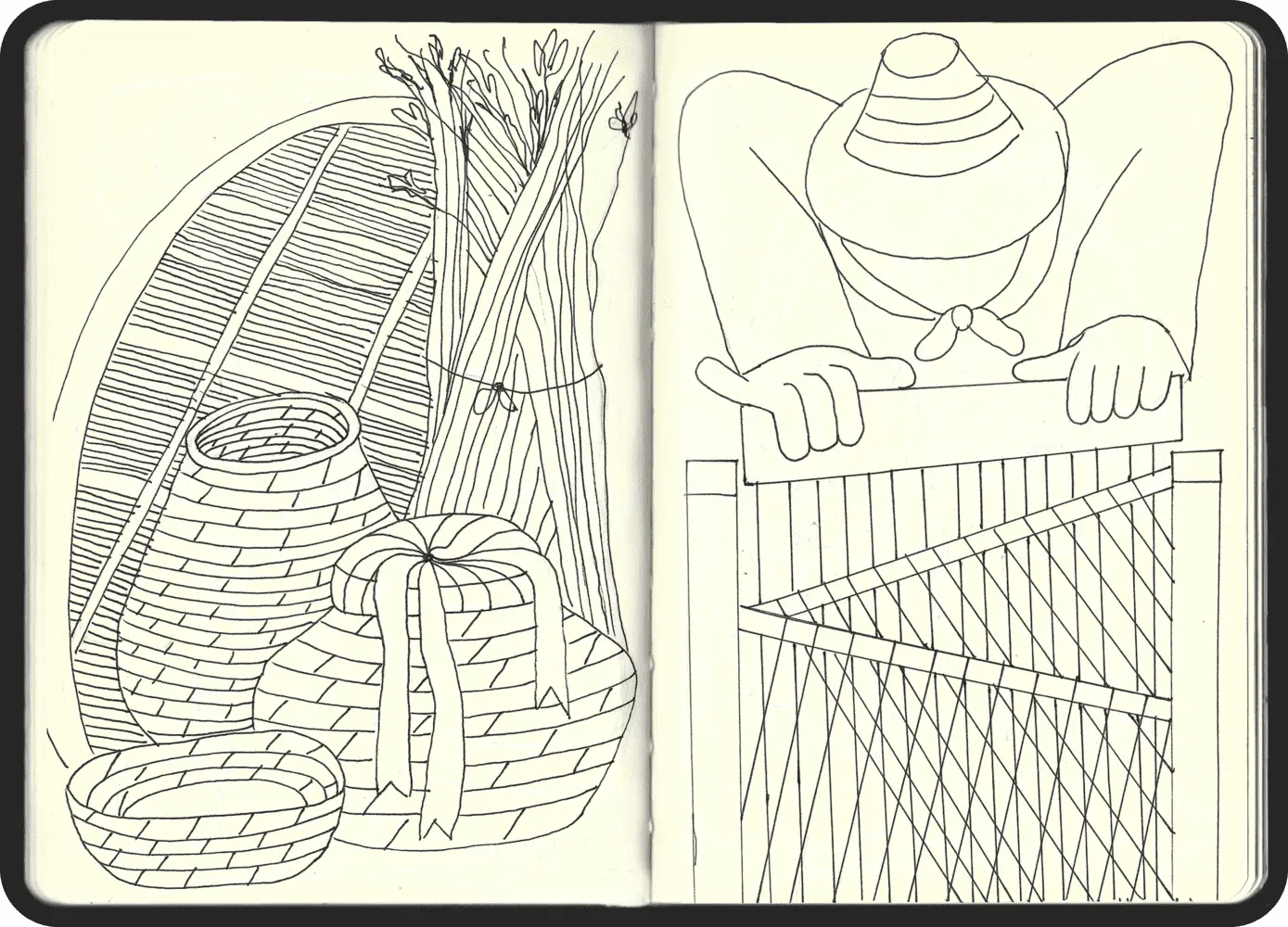
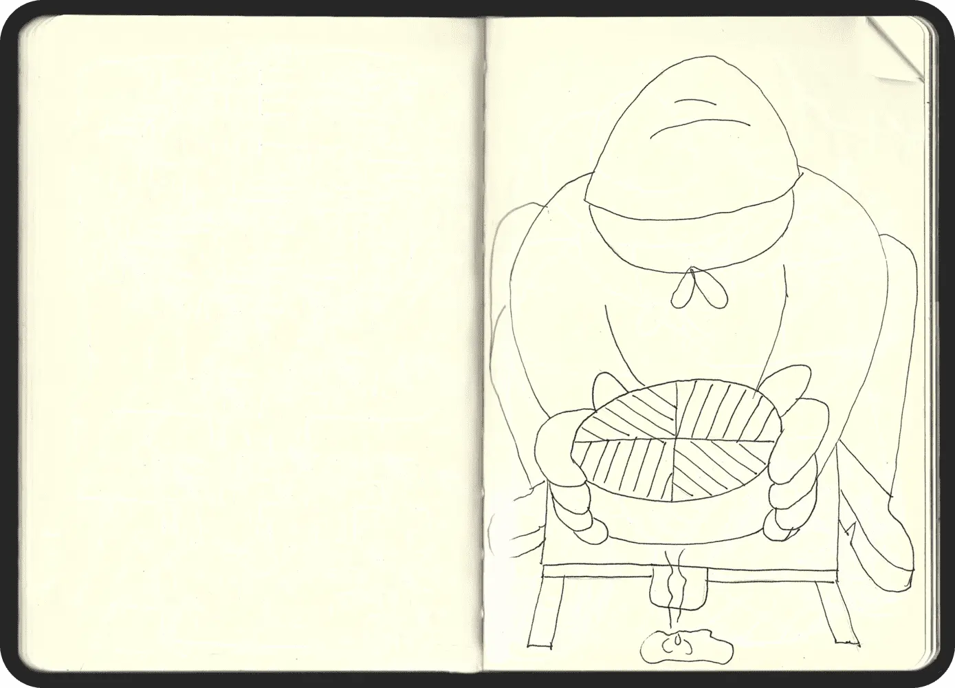
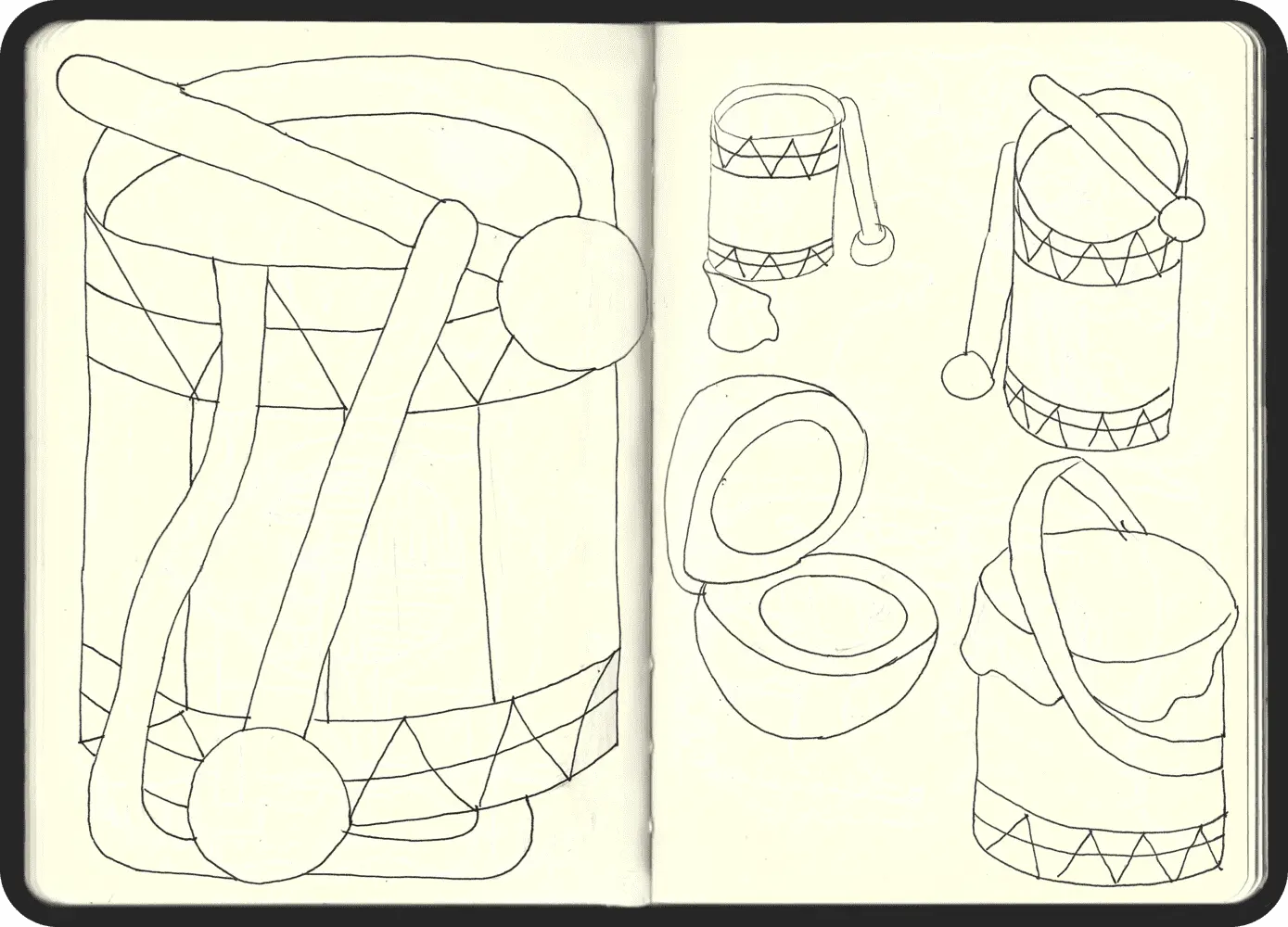
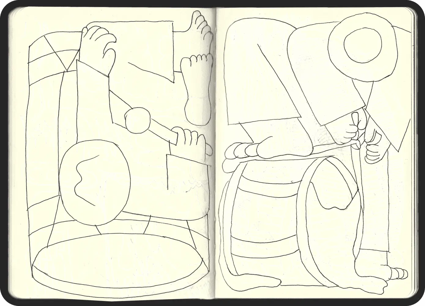
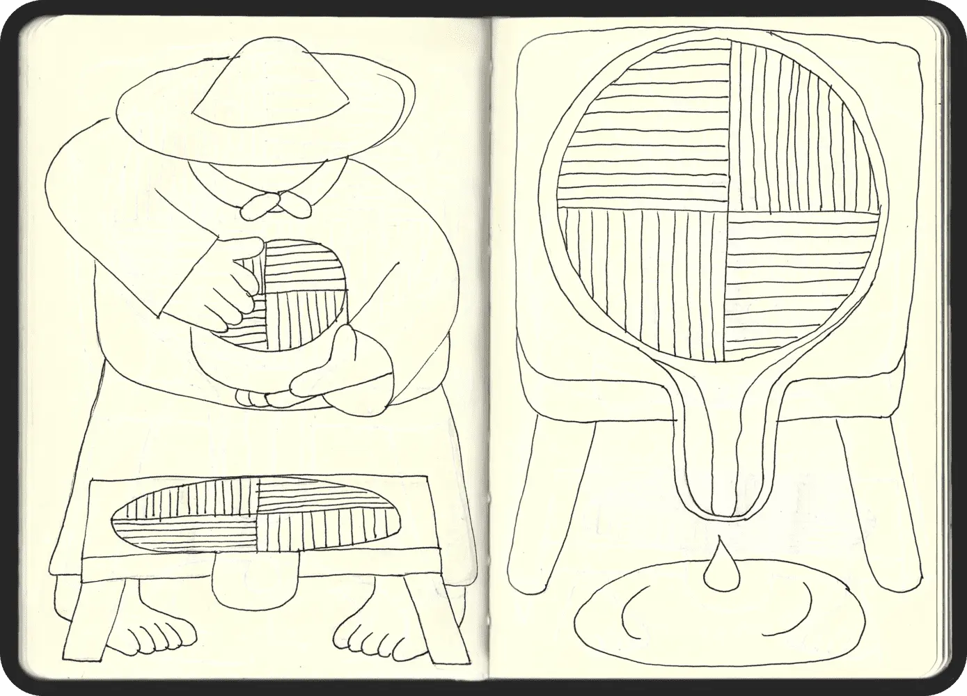
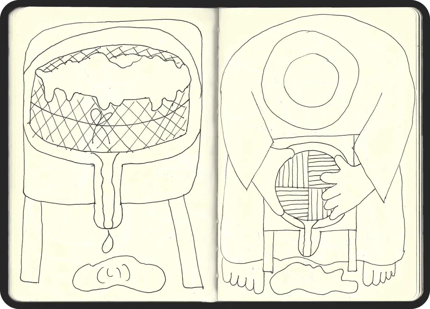
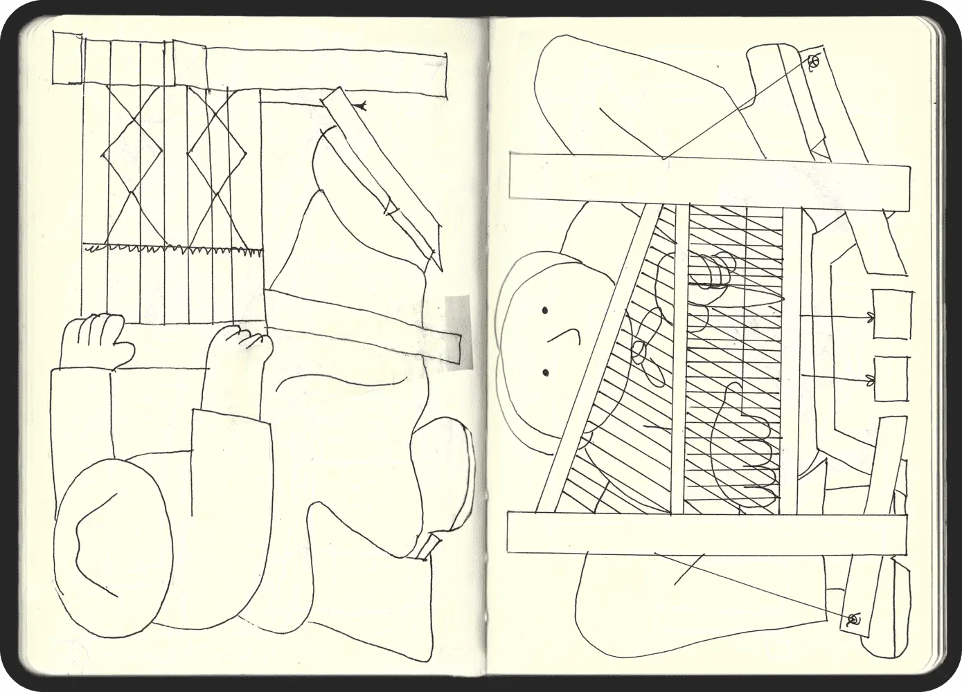
We aimed to depict the three primary traditional trades in El Hierro: drum artisans, weaver artisans, and cheese artisans. These occupations were central to the island's economy in the mid-20th century and symbolise its cultural heritage.
PROJECT GOALS (II)
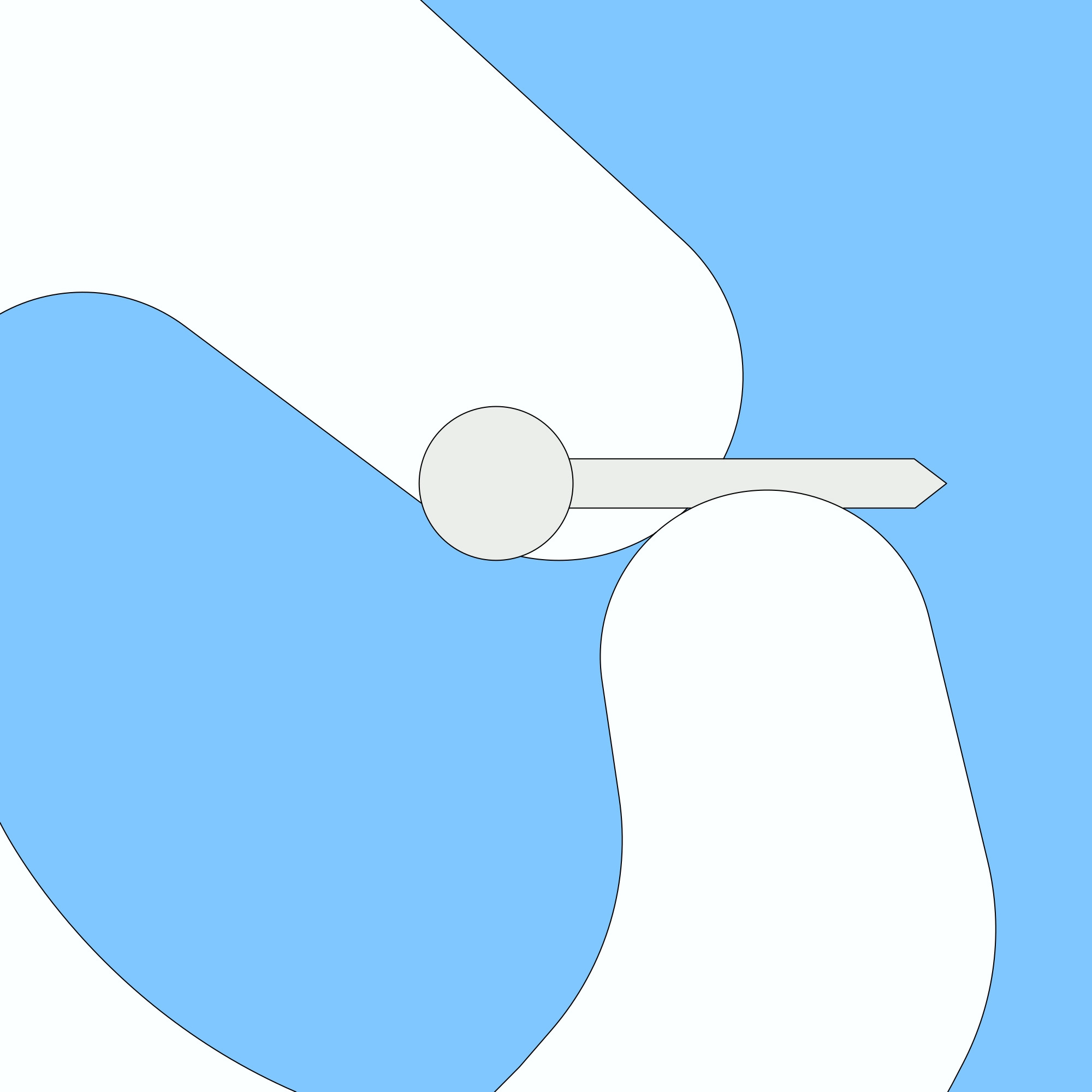
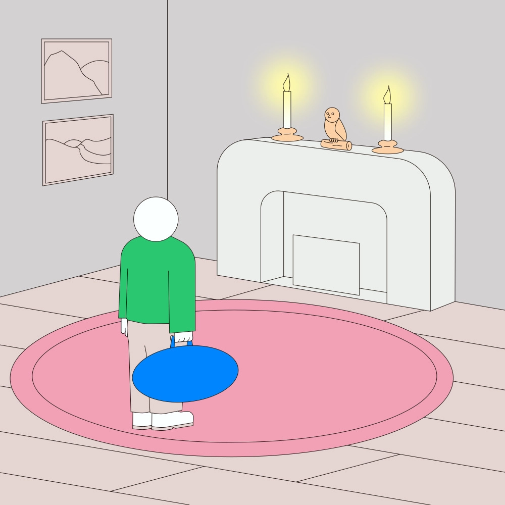
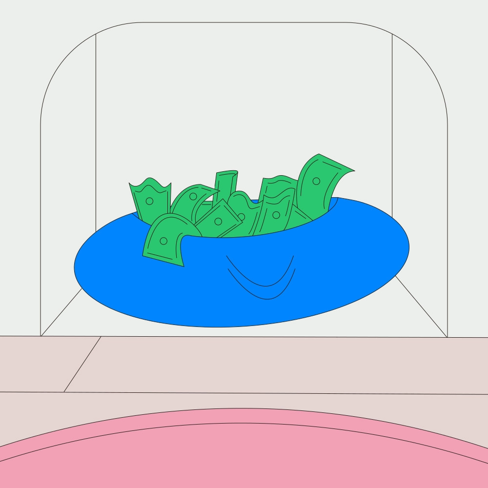
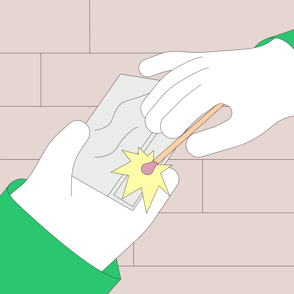
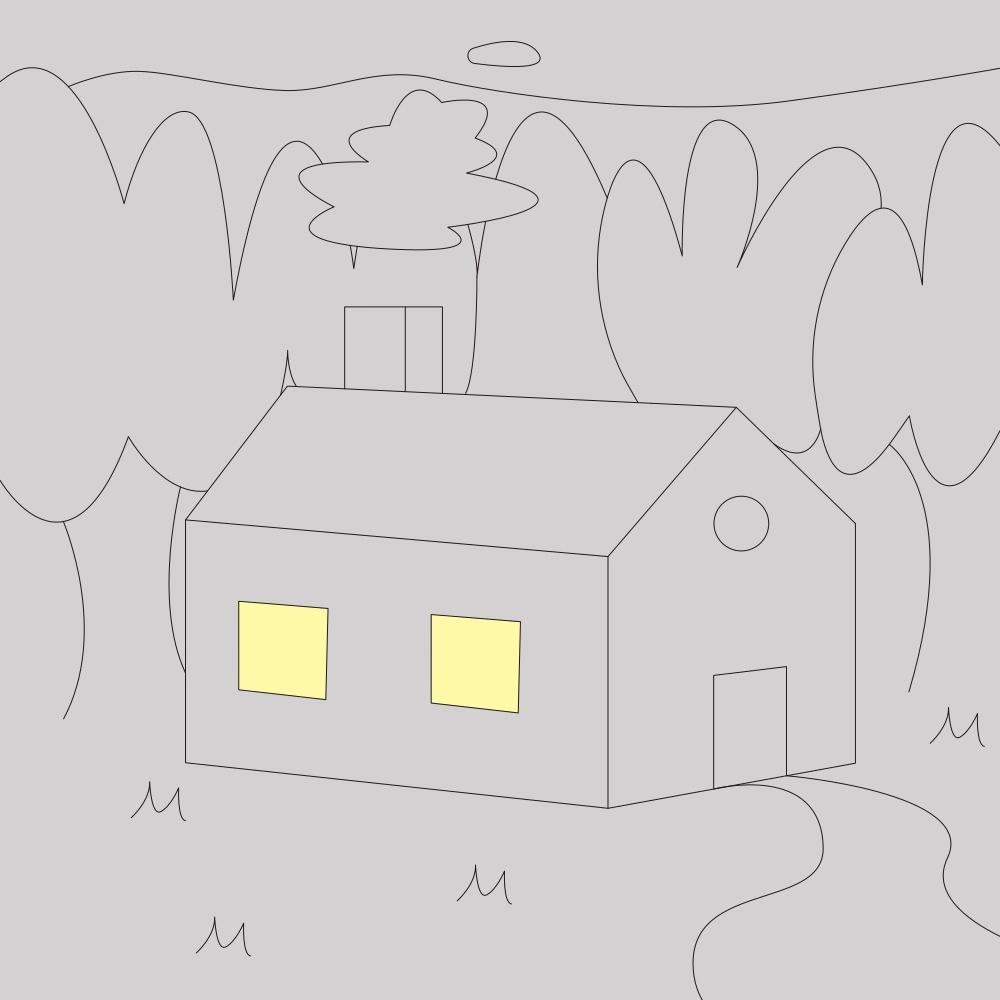
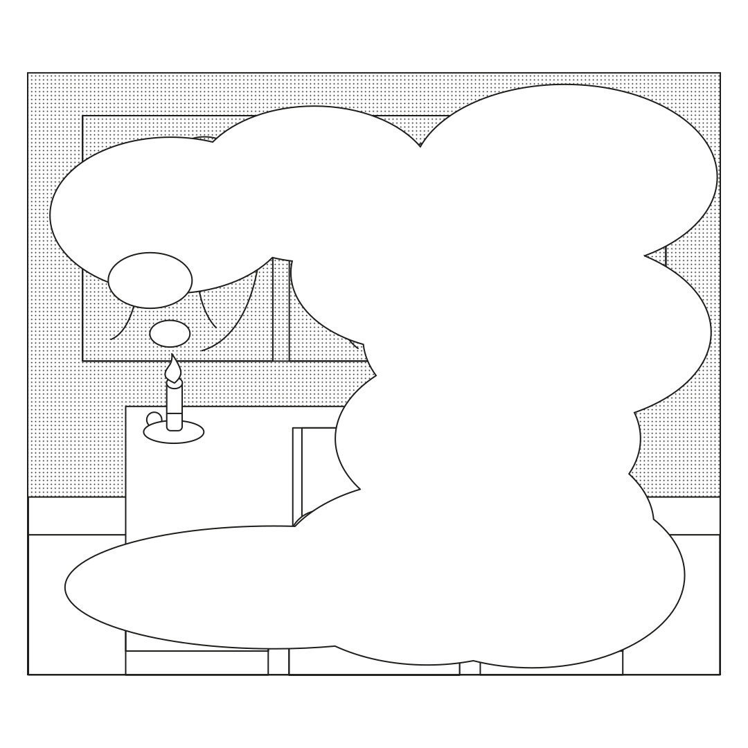
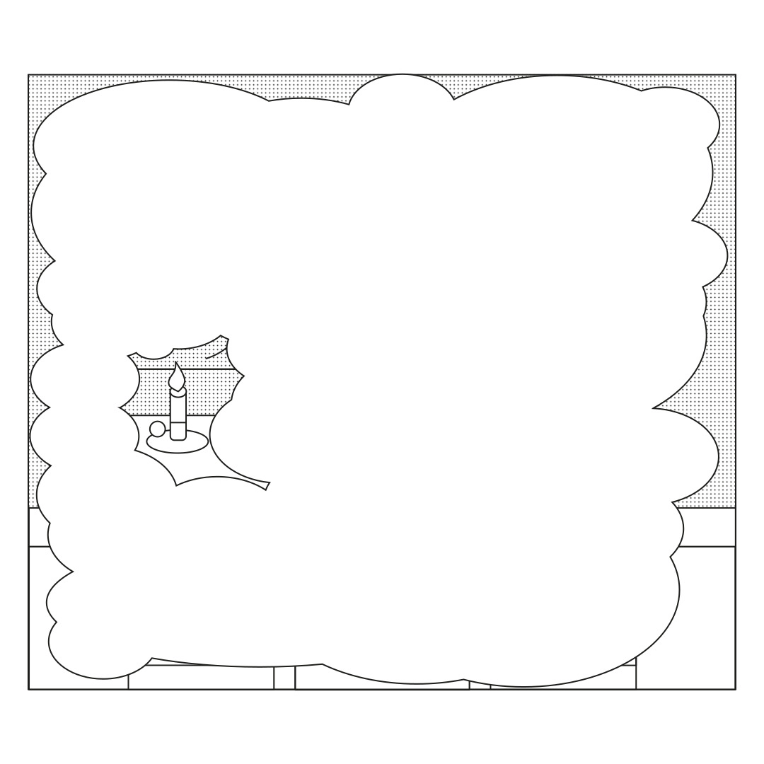
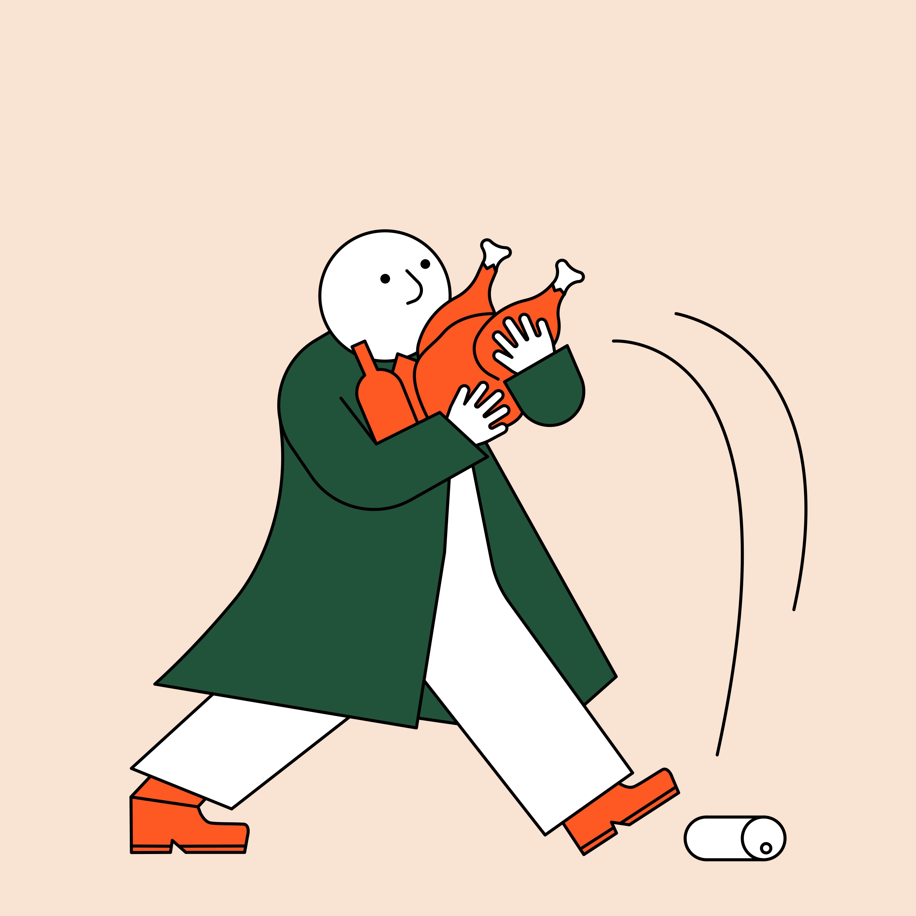
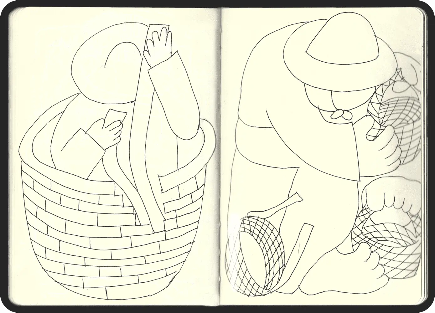
We watched numerous videos of artisans at work and endeavoured to distill their movements into minimal expressions. Rafa had a keen eye for this and was able to replicate it while also considering the composition of the drawings, playing with all elements within each scene to convey a sense of coherence.
GRAPHIC ELEMENTS
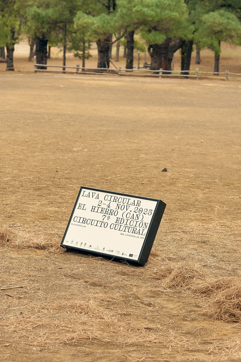
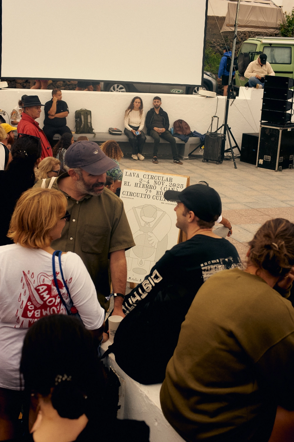
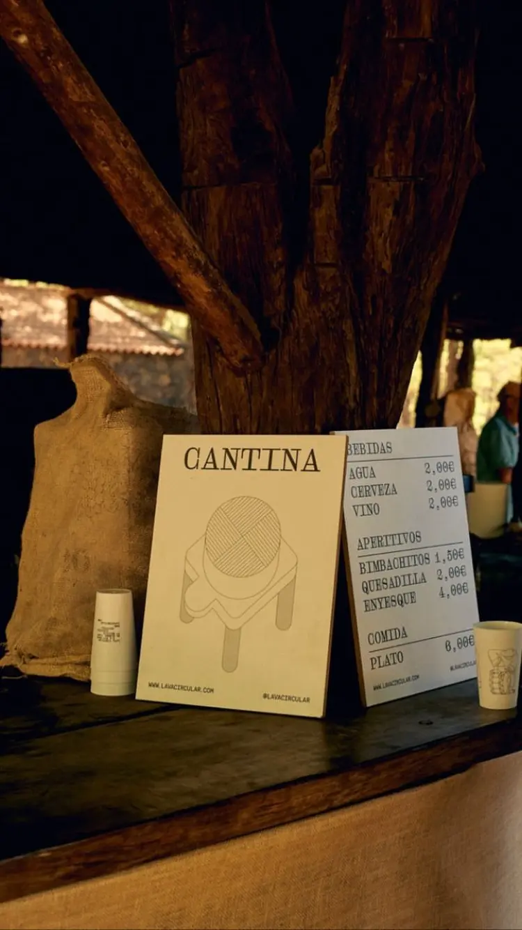
In addition to the captivating animations and illustrations, typography assumes a pivotal role in shaping the overall visual narrative. Employing the Droulers font —crafted by the esteemed Bureau Brut foundry—, adds a distinct layer of character to the composition. This monospaced typeface exudes a remarkable personality, distinguished by its intricate ornamental flourishes. These embellishments not only lend a touch of sophistication but also forge a compelling visual interplay, seamlessly juxtaposing the illustrations' language with an undeniable coherence.
DRAWING
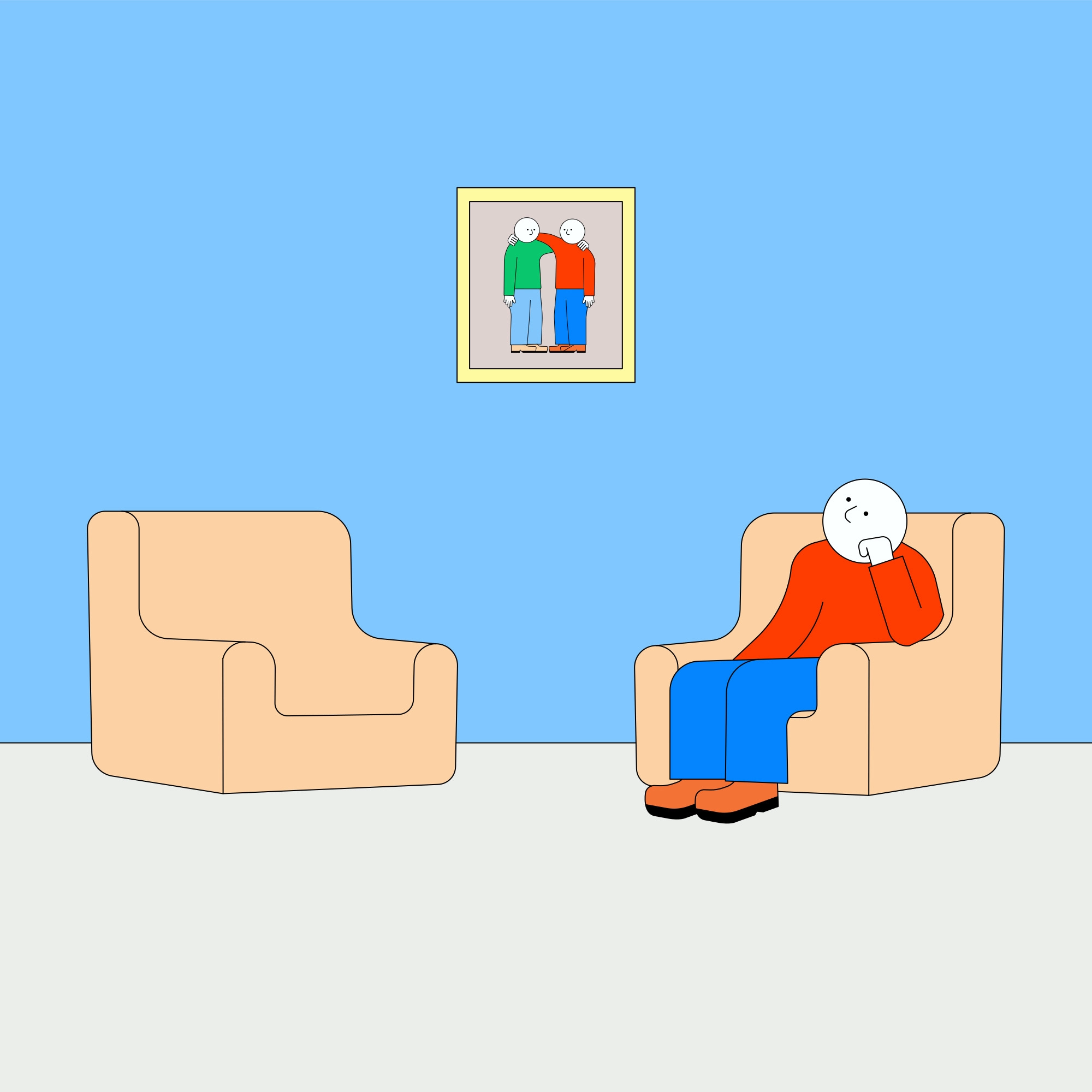
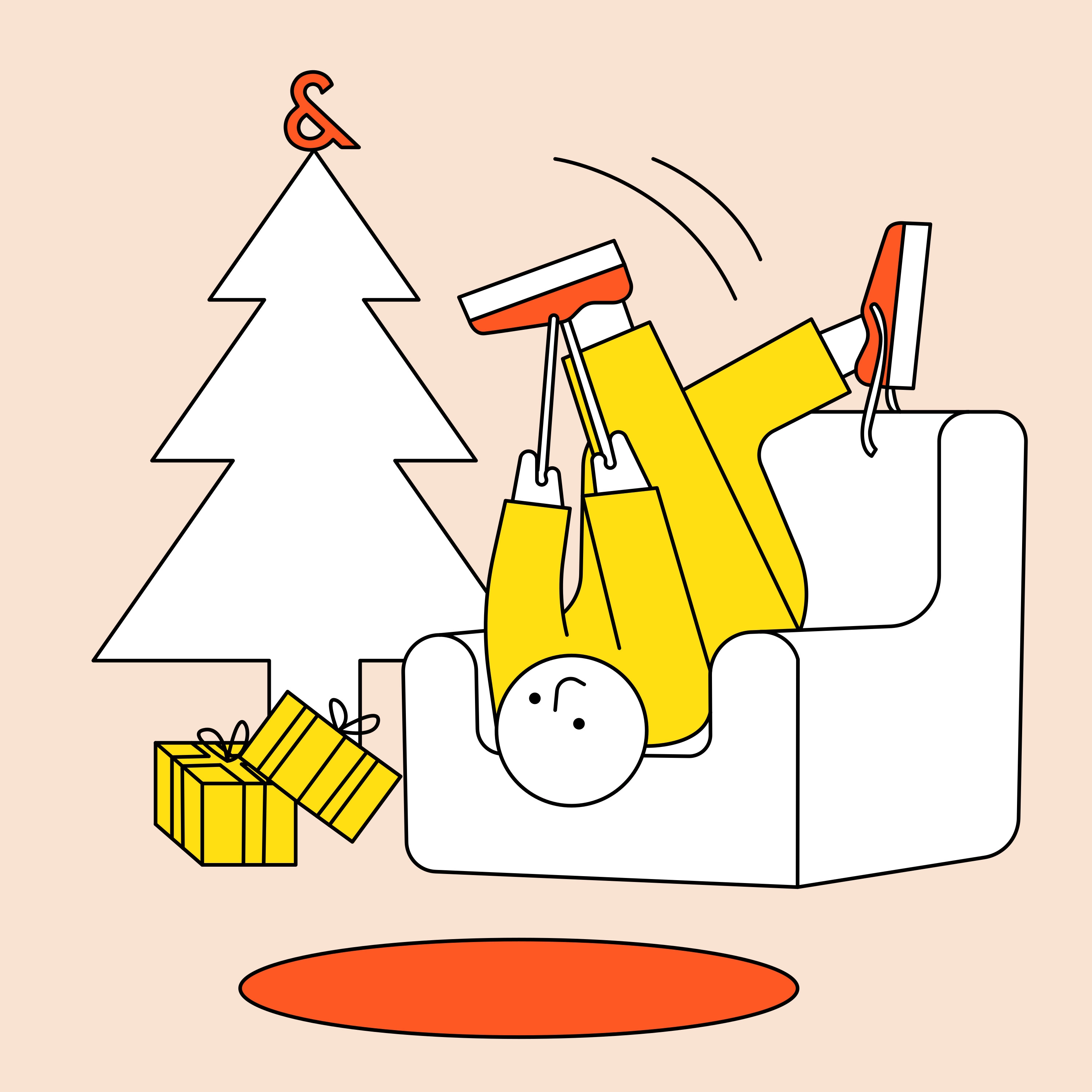
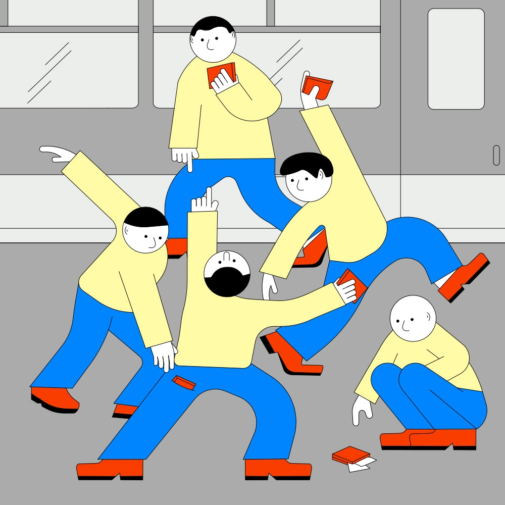
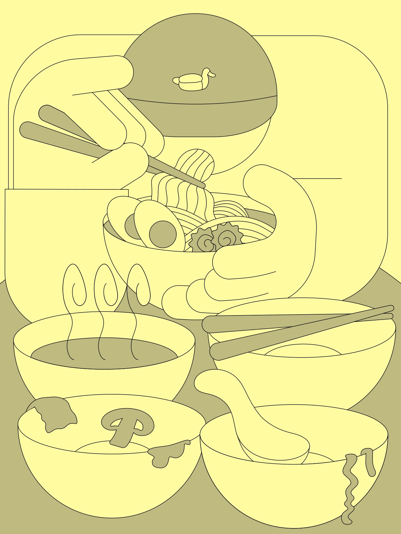
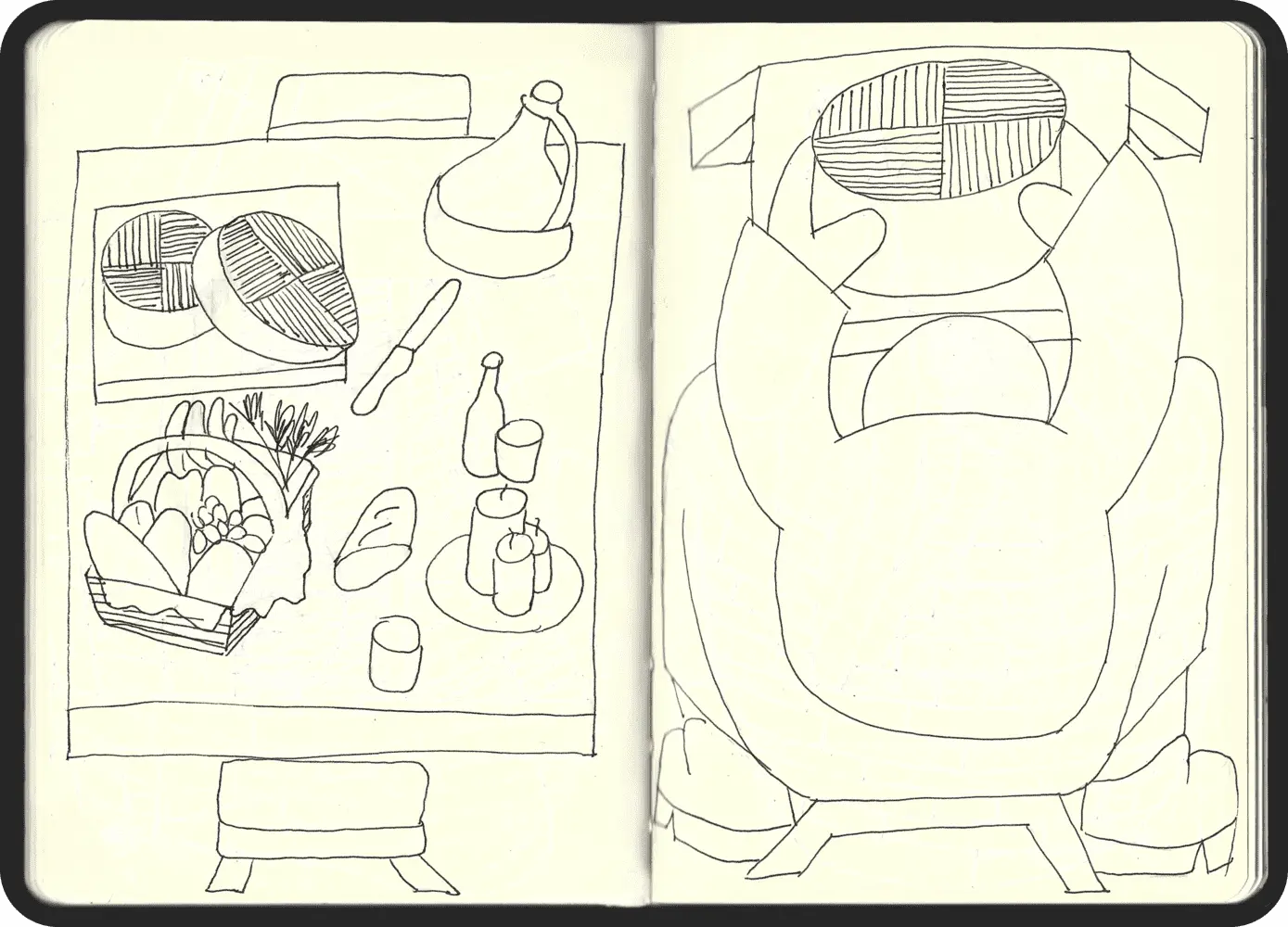
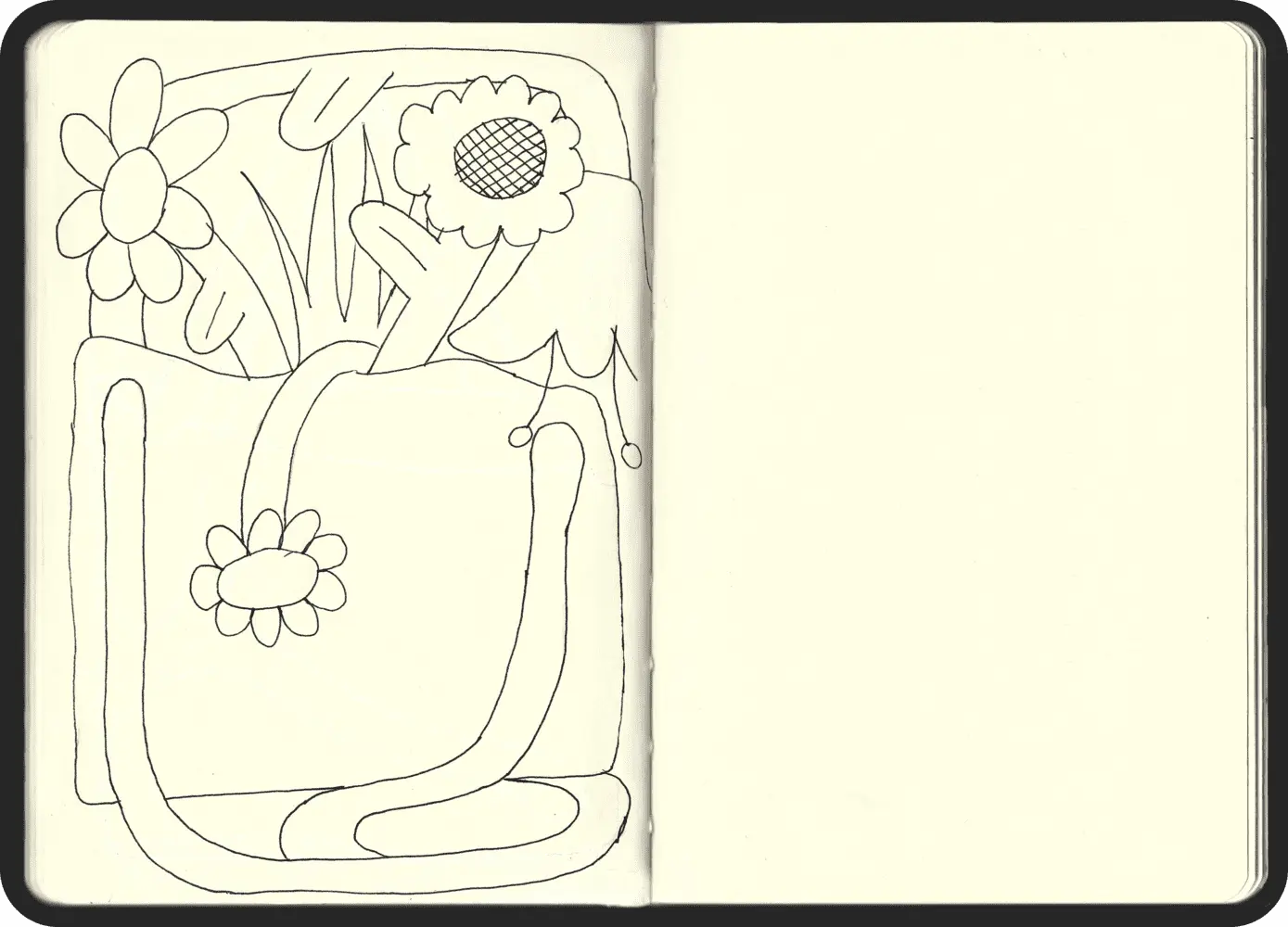
One of the primary challenges in the illustration aspect was infusing a sense of playfulness. Working with a limited color palette compelled me to focus on body shapes for expression. I opted for slightly thicker and larger bodies, as individuals from rural areas are often robust and sturdy. This deliberate disproportionality aimed to capture their physical presence authentically.
To inject a playful vibe, I experimented with perspectives, resulting in drawings that feel whimsically odd yet visually coherent. Notably, the characters' faces are not visible, emphasising their profession or activity, adding an intriguing layer to the illustrations.
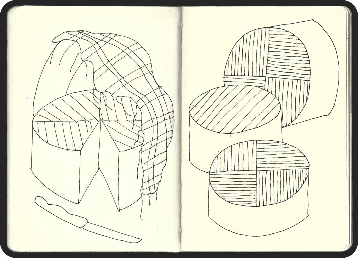
SKETCHES
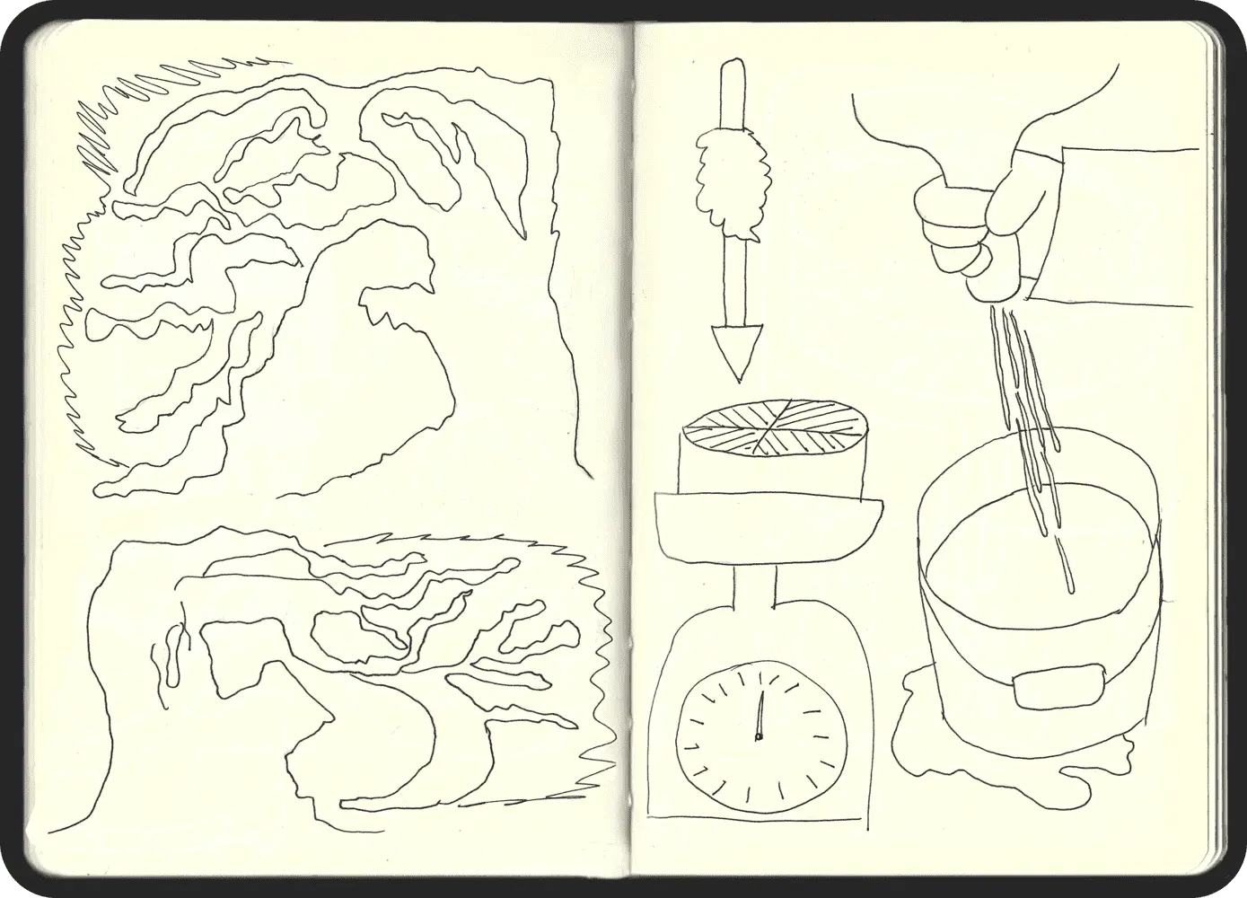
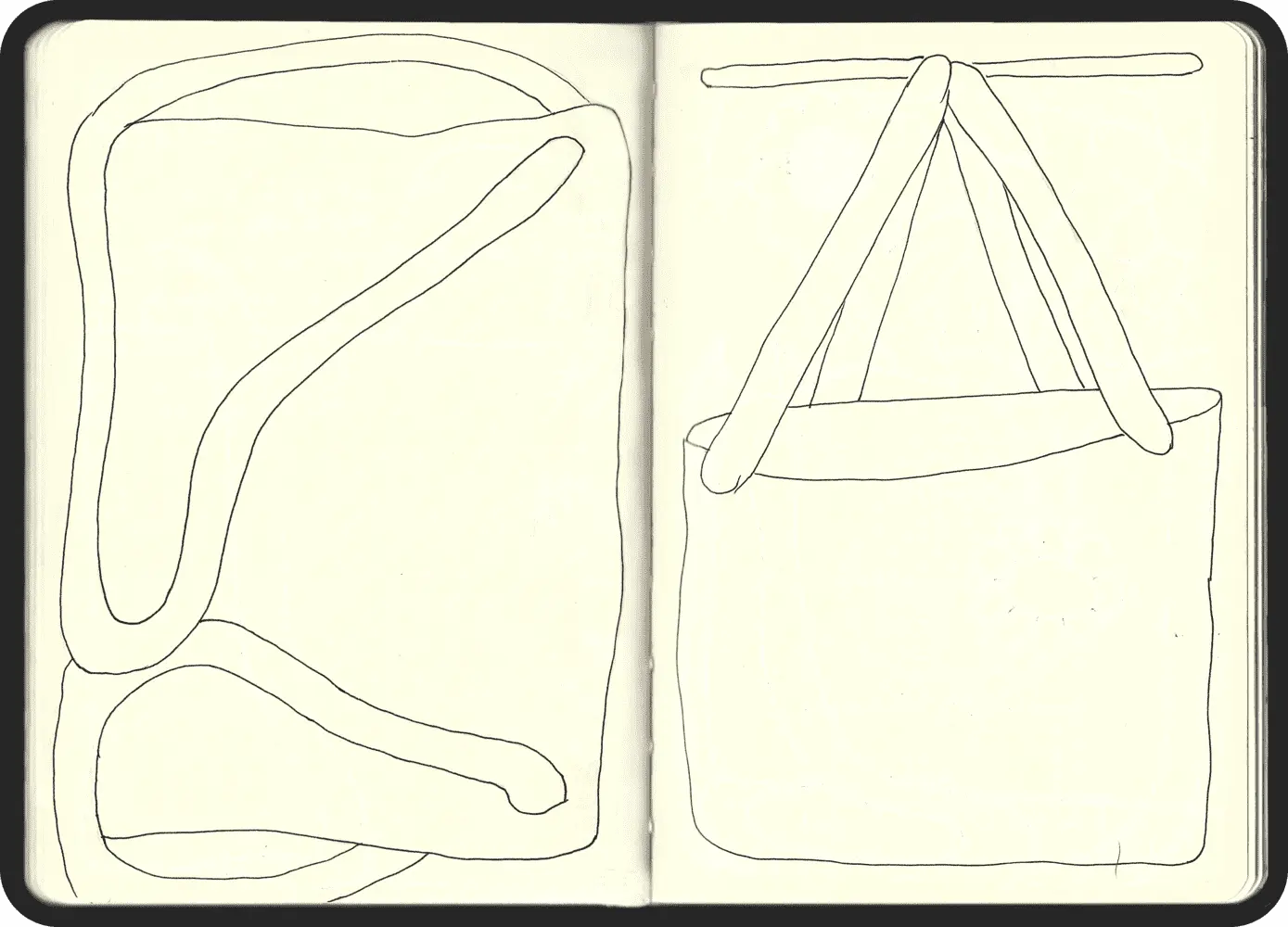
One particularly beautiful and interesting aspect was the process of creating the illustrations. Many of them were drawn during my time in La Gomera. I decided to spend the summer exploring the island and stayed in a sustainable cabin in the heart of Valle Hermoso. Each night, we were serenaded by the chirping of crickets, fully immersed in nature. I often found myself sketching by the sea, accompanied by the rhythmic crash of waves, or amidst the tranquil mountains.
My grandfather belonged to the last generation of residents in Las Palmas de Anaga, one of Tenerife's most remote villages. Growing up, I witnessed firsthand the toil of rural life—watching my grandfather craft cheese and observing elders weaving fabrics or carrying potato bags. This upbringing deeply roots me in the land and its traditions.
CREDITS
PROJECT
Lava CircularORGANIZERS
HislaART DIRECTION
Santanasantana StudioANIMATION
Rafael GrullónPHOTOGRAPHY
Adrián Ríos
